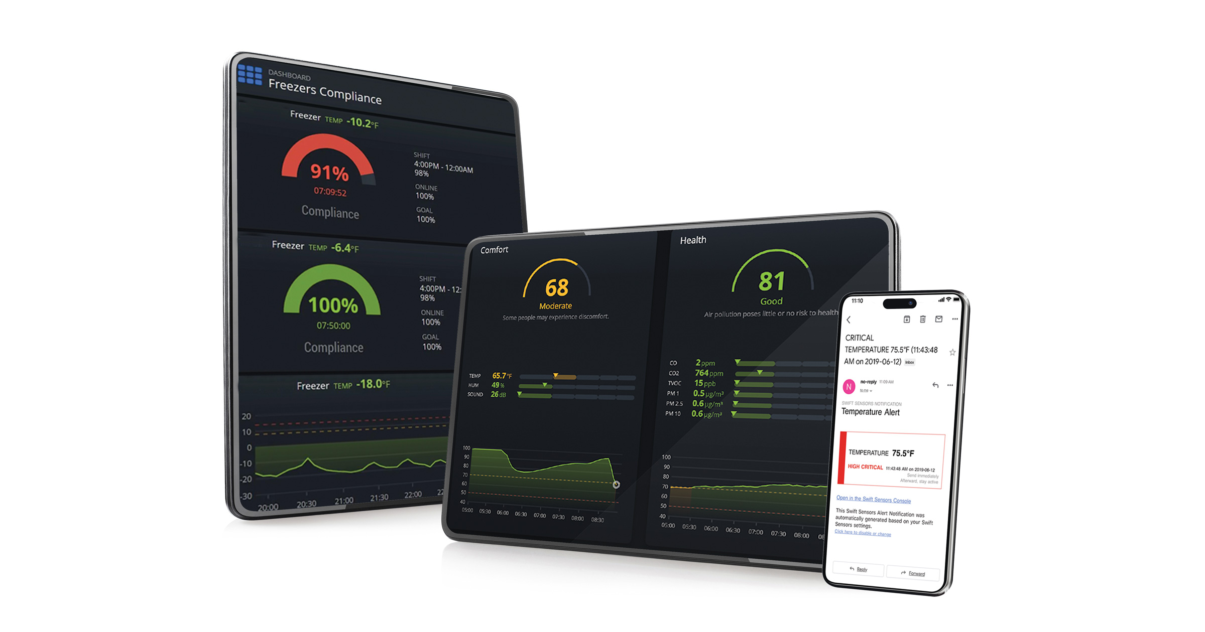
View real-time analytics, download compliance reports, and receive instant mobile alerts on any device.
Swift Sensors offers an innovative suite of wireless sensors designed to remotely monitor the performance of a wide variety of equipment. Swift Sensors offers over 30 types of advanced wireless sensors that measure anything from temperature and humidity, to vibration, contact, and electrical activity. Monitor a single room, an entire property, or multiple facilities remotely on any approved device 24 hours a day, 7 days a week. Reduce production downtime, prevent loss of assets, satisfy regulatory requirements, and guide health and safety procedures with Swift Sensors monitoring, alerts, and reports.
Instant Alerts
Swift Sensors provides configurable instant alerts enabling immediate corrective actions when significant events occur. Alerts can be sent to individuals or groups via SMS text, email, or voice.
Swift Sensors provides a robust analytics platform enabling trend analysis, historical documentation, compliance reporting, and deep insights into equipment performance, facility operations, and environmental conditions.
The Swift Sensors console is scalable and customizable to fit the needs of any size organization. Create custom dashboards and tag and label equipment, rooms, and buildings for unparalleled ability to search, filter, sort and view critical sensor information.
Once the sensors and gateways are deployed, a small Swift Sensors array can be up and running in minutes. The sensors automatically pair with the gateways and immediately start sending measurement data to the cloud to be viewed in the console.
View analytics, download reports, and receive instant alerts on any device. Contact us to find out how our wireless sensors work together to provide a comprehensive view of facility operations.