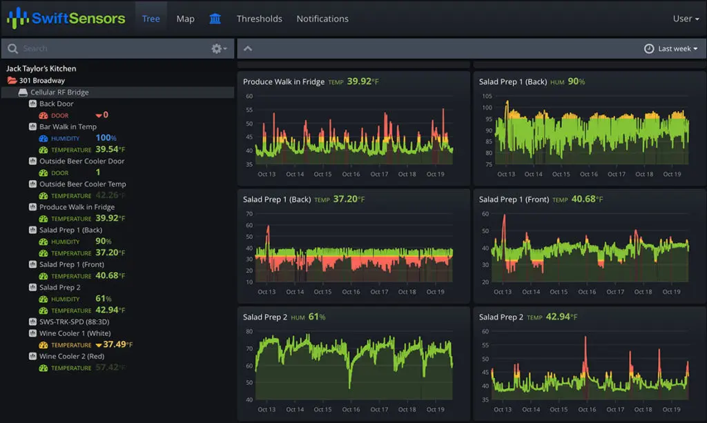
Charts show historical and real-time data for each sensor.
Select viewing times of hours, days, or months.
Select any section of the chart for in-depth viewing and analysis.
Colors on the charts denote measurements that have exceed configured thresholds.
Tree or Map View with Browser Based Dashboard
The entire sensor system is shown in a hierarchical tree view or map view. The map view shows the actual location of your sensors. Select a gateway or sensor to view data from all sensors connected to the gateway or to drill down into the detail of a single sensor. Administrators can assign role-based permissions to give access to departments and management levels.
Learn how Swift Sensors can protect your facility.